Connecting family members and friends for more active lives

Type of work & Time
End to end in-house UX design at a startup; 2025 Q1 - Q2

Role & Team
Sparring with lead designer. Collaborating with a physiologist, CEO, CTO & DEVs.

Company & Product
Mia Health is a research-based app that tracks exercise impact to stay healthy
Problem
Staying motivated without social support is difficult
Some users lack strong exercise habits, and even active ones benefit from a push. Research shows they're more motivated when sharing progress.
Solution
Connecting friends, so that they can share activity and motivate each other
A complete design and flows for a "friends feature". Users can invite and add friends and share their activity.
Key metrics
+24%
Increased physical activity,
measured in Mia's Activity Quotient.
The process
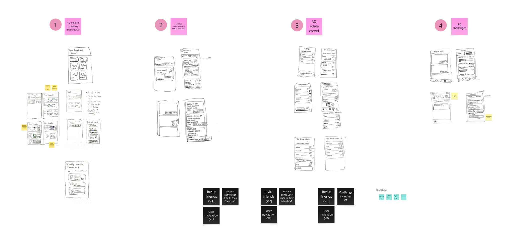
Discovering different options of how could people connect and motivate each other inside Mia Health
Research and our previous app showed that users are more motivated when they can share their activity progress. This insight led us to explore different ways to make social sharing possible.
Testing early concepts in interviews: What feels the most motivating but also comfortable to share?
As part of our continuous interviewing efforts, we showed users sketches of the concept to gather early feedback. We learned that some users were concerned about sharing their activity during periods of illness or when they simply weren't in the mood to exercise. They expressed that constant visibility of their activity levels might feel invasive, like being "stalked" by friends.
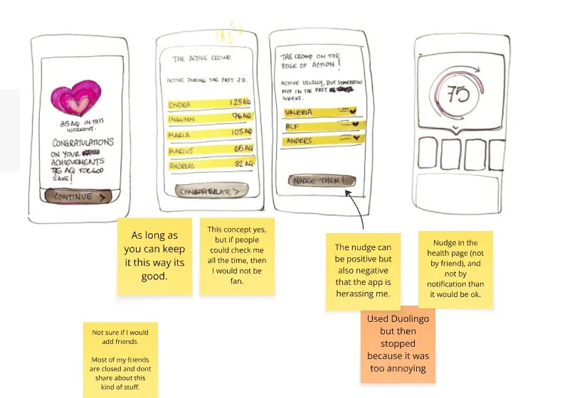
Image from interview notes. Sketches made by a lead designer, Valeria.
What do we want to achieve? Increase Activity Quotient (AQ) of users with friends.
I started a discussion about our goals for this feature to make sure we could measure its success. Our North Star Metric at Mia is the total AQ earned by monthly active users, so we aligned our objectives with it. Together with the lead designer, we set two main goals:
- Higher AQ earnings from users with friends
- New users being registered through friend invites.
Testing AQ Sharing with Family Plan Members
My colleague Valeria, the lead designer, was working on the Friends and Family subscription plan and we decided to include the AQ sharing to test it with this smaller user base. This was a perfect opportunity to release this feature to a smaller user group. This was important because from interviews we knew that AQ sharing could be a sensitive and controversial subject and needs to be approached carefully.
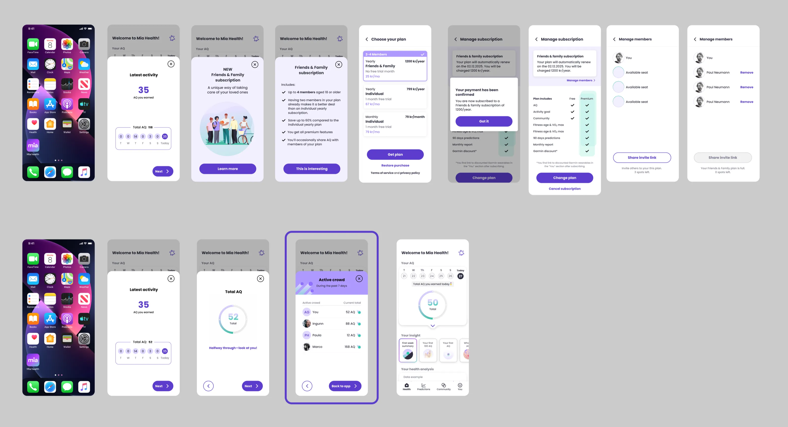
A Friends and Family subscription flow designed by lead designer Valeria (1st row). With this subscription the user was getting the AQ sharing (2nd row).
Beta usage surprised us: Users want to Share AQ (Activity Quotient) more than we thought
Based on one or two interviews where we saw a bit of a fear of sharing AQ all the time, we thought it would be best to share AQ on a limited basis so thats what we originally designed. From the interviews, we felt a bit of fear of being stalked at all time by your friends or family. So we made it possible to view the AQ of your friends only after you exercised yourself.
However, we were not 100% sure about this, so we created a way for users to leave us feedback directly in the app. And we got a lot of the same replies:
Yes! We like looking at it in my family, and it is therefore a minus that we can only see it after an activity.
We have an internal competition and would like to see aq friends at all times.
Every time a user submitted a feedback, I got an email, and at one point I got a multiple emails a week. In context that only a few hundred of users had the family subscription, this felt like a lot.
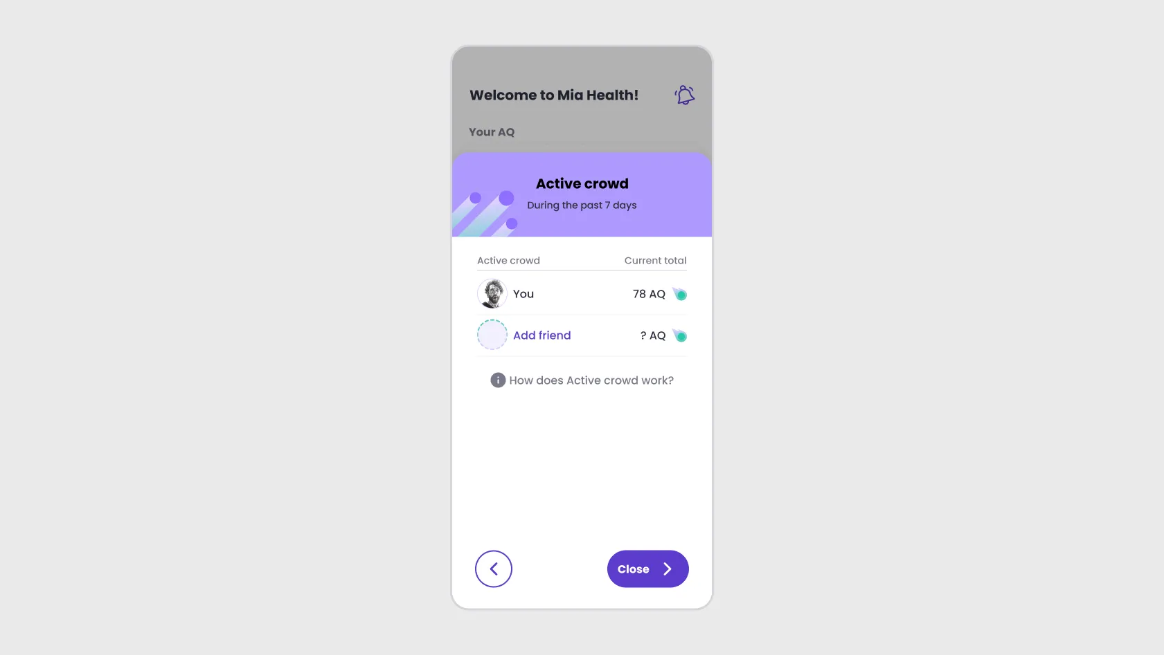
Building in discoverability & potential virality
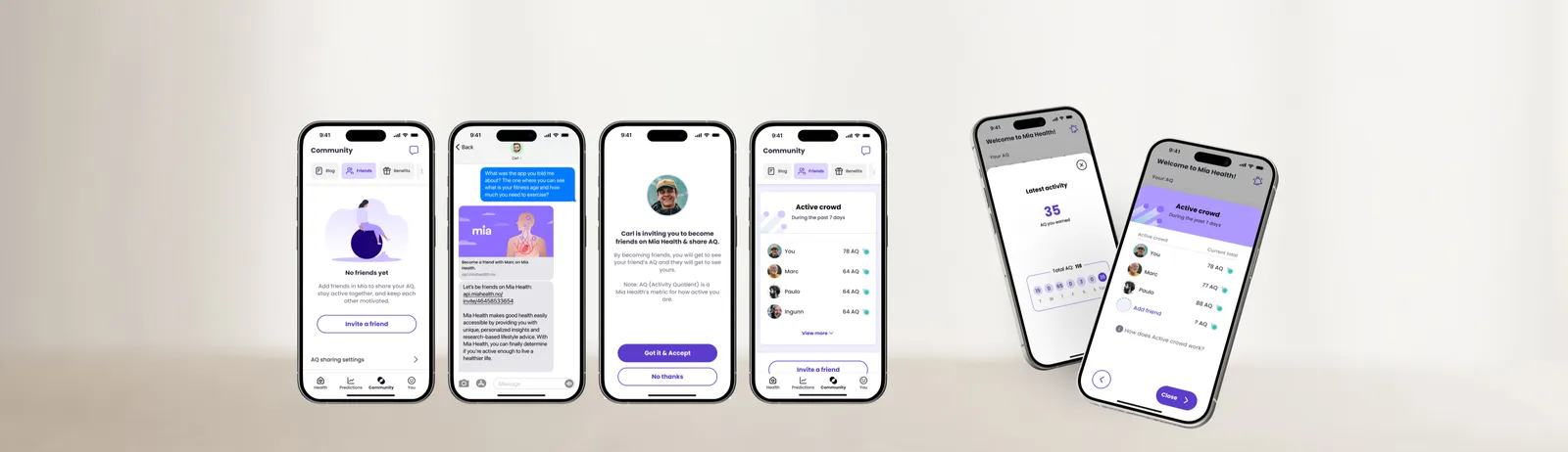
Adding friends will be a new feature and we wanted users to naturally discover this. To also motivate them to add new friends, we wanted to spark a bit of curiousity in them. With the screen here, we make them curious about how much AQ could their friends have, but also we right away show them the value of adding friends.
The engagement goal succeeded, but organic growth fell short
After multiple iterations, we completed the designs and launched the feature.
Full flow of adding and inviting friends in the Mia Health app.
In the first week, we compared users who had added friends with those who hadn't. The engagement goal delivered: users with friends earned 24% more Activity Quotient than those without. The social layer was doing exactly what we'd hoped, making exercise feel more shared and motivating.
The growth goal didn't land. Only 12 new users registered through friend invites. Out of roughly 100–200 friend connections, very few led to someone new downloading the app.
These are first-week results only. I left the company shortly after launch, so longer-term data wasn't available to me.
A feature that motivated users but didn't grow the user base
The invite was easy to send, but not compelling enough to act on
In section #6 we designed for discoverability and potential virality. The invite flow itself was frictionless, just share a link. But the friction wasn't in sending the invite. It was on the other side. The recipient had no independent reason to download Mia, create an account, and start tracking their exercise. The sender would need to personally convince them why this app matters, and exercise is a deeply personal, often private thing. The product couldn't sell itself through a link alone. Friend invites in a health context may need a stronger value proposition for the recipient, not just the sender.
Without analytics, we couldn't learn fast enough
One thing I'd approach differently is how I advocated for better analytics. I did push for more advanced tracking across the product, but I wasn't able to make a strong enough case for why it needed to be prioritized. Without proper infrastructure, tracking results meant asking the CTO to run database queries manually. Next time, I'd come with clearer arguments for why understanding user behavior in detail (how many invites were sent, how many links were opened, where people dropped off) is essential to iterating on features like this. The data we lacked was exactly what we needed to improve the growth side.